Design 101 for the Solo Social Media Manager

Guest post by Felicity Hamilton – Junior Designer at Social Misfits Media
As a social media manager, you’ll undoubtedly have many strings to your bow. Whether you’re juggling multiple clients, stakeholders or roles (aside from managing your company’s social presence!), a lot is expected from you. One day you could be a copywriter, the next official photographer, the next analysing and reporting. Arguably the most daunting of all is when your design skills are called upon to knock up a quick social media asset, such as a Twitter card or Facebook banner, especially if your design experience is limited. Here, to remedy any self-doubt about your design skillset is a handy 101 for creating effective social media assets as a small team or solo social media manager.
What’s the goal of your design?
The first thing to consider is the purpose and goal of your design. Ask yourself: who is your target audience on social? What are you hoping to communicate with them? Scribble this at the top of your notepad or sketchbook. This will inform your design decisions and help you create something relevant and effective.
Does your company or client have pre-existing brand guidelines?
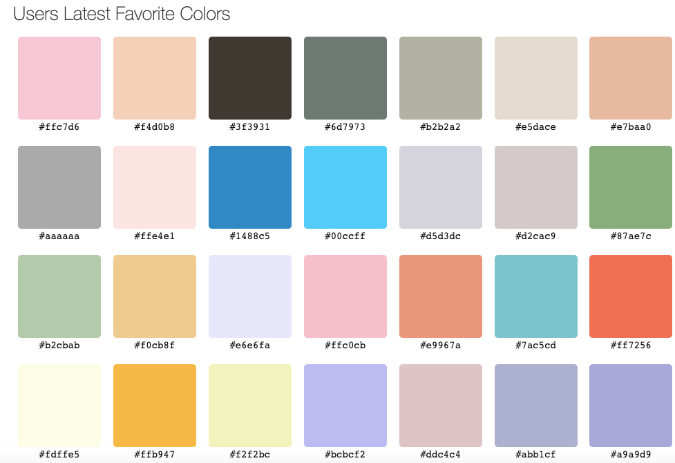
Before coming up with any ideas, it’s important to check the brand guidelines. Often these can be found with a quick Google search. It will list any colour codes, what fonts to use, how to use their logos and any rules they follow. Make sure you download any assets you might need from these pages to make sure they are up to date and in-line with the organisation’s brand. If you’re working with a smaller organisation, they might not have any brand guidelines online. Don’t panic! You can send a quick email and ask for clarification on colours, fonts and anything else that might be important for you to include in your asset.
Post Dimensions
Make sure you’re designing something in the correct size for the platform. Both in its dimensions, DPI (quality) and file size. There’s no use in making something amazingly considered if it’s totally the wrong size. Lightful, our sister company, have recently published a handy guide where you can stay up to date with platform guidelines on dimensions.
Graphic Design Fundamentals
This is the part that might seem scary if you’re a design novice – key graphic design concepts. However, don’t let this throw you off balance – they provide a helpful framework for creating a design that’s easy on the eye. If you think of each individual element as having its own flavour contributing to the overall personality of design, you’ll be able to use them to your advantage.
- Contrast: Graphic Design has a lot to do with the relationship between objects on a page. If objects are close, they appear to be related. A small object will look even smaller next to a large object. A serif or cursive font will stand out more next to a sans serif font. Consider how each element is complementing those around it.
- Hierarchy: This is all about prioritising what’s on your page. What information is the most important? How can you make it really pop on your page? Consider using different fonts, colours, layouts. Test out different ways of doing it in your sketchbook before you settle on the one, and don’t be afraid to shuffle your design around if it’s not working.
- Fonts: Chances are your organisation already has brand fonts – so stick to these! You can most likely download them online or request them from your client. In the event that you’re looking to choose new fonts, pick one that is clear and easy to read such as a sans serif and then add a ‘hero’ font – something with personality. You can also go to websites like Typ.io to find dream pairings and give you some inspiration. Make sure text is minimal on a social asset and easy to read!
- Colours: Similarly, your organisation probably has brand colours. Find their colour codes and make sure you’re using these exact colours. If you want to add colour to your design, colour-hex is a great (and free!) online tool for checking complementary shades to existing colours, as well as tints and shades. Also, consider how the colours you’re using might evoke an emotional response. Are you trying to excite? – maybe use a high contrast neon. Are you trying to relax? – perhaps go for baby blues and lilacs. If you use colour intelligently, it can really add to your asset.
- Balance: This refers to the overall weighting of objects across your asset. You might assume that it’s either balanced, or it’s incorrect. However imbalanced designs can work just as well. If you’re trying to show how big something is, you might want to heavily weight your design to one side of it. If you want to show a regimented order, you might want to perfectly spread the weight throughout the whole page. Test this out in a sketchbook with a quick thumbnail to see what works best.
Be Inspired
We all have our uncreative days. If you’re drawing a blank, the best way to get your creative juices flowing is by finding some inspiration. Next time you’re on the tube or at a bus stop, look at the ads – why do they work? Stay switched on and you’ll learn so much just from observation. There are also great design blogs such as Creative Boom which has great design work to inspire you. Pinterest is also great for some asset inspiration. Pinch little ideas from different designs to make something new and fun! You can then test out these ideas on your social – what designs perform well? – How can you expand on this? Social is all about being inspired, testing, learning and growing. You can always build upon what’s worked well and
All-In-One Tools
If you’re really struggling and need something fast, use online tools. If you have access to Adobe Creative Suite, they have an online resource called Spark specifically designed for creating social assets. There are lots of pre-made templates in here for you to get a head start on your design. Canva is also great for creating designs online. Apply the rules and ideas you’ve come up with to a pre-existing template and chances are it’ll come out perfect.
With any luck, this article will have helped make your role as a hardworking community manager with a million things to worry about, a touch less chaotic. I know this is a lot of information to absorb at once, so you can keep this article open in a tab to refer back to it if you need to. The last secret bit of advice for you is just to give it a go! Be confident, trust your instincts and don’t get caught in the ‘I’m not creative’ trap. As with anything, the more you throw yourself into it, the better you’ll be. The worst thing that can happen is you’ll have to rework something – which happens to every designer almost every day. So with that in mind, go forth and make some wonderful social media assets. They’re going to be amazing.
Latest articles

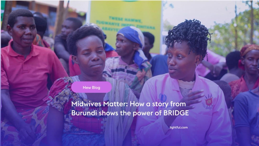
Over the past year, Lightful and the International Confederation of Midwives (ICM) have supported Midwives Associations across Africa, South Asia and the Eastern Mediterranean to build their digital confidence through our BRIDGE programme. These organisations were starting from very different places, but all shared the same goal: to use digital tools to strengthen their voice, raise their visibility and advocate for better outcomes for women and babies.
Related posts

How familiar are you with sustainable web design? Here are Lightful, we are currently working on a redesign of our website so we wanted to find out more about sustainable design and what this means for us.
My name is Vikram and I’m a Canadian ex-pat living in the UK. I was hired by Lightful in late June 2019 as a Senior User Experience (UX) Designer. My reasons for wanting to join such a company are manyfold, but primarily stem from wanting to do something that makes a difference. When I say this, I really do mean ‘difference’ in terms of making life better for all, not for fulfilling a generic company vision!
See who we help


Contact us
Want to learn more?
Email Jonathan and start a conversation